Topics in this domain
- Risk Response Options: Accept, Mitigate, Transfer, Avoid
- Aligning Responses with Appetite and Tolerance
- Cost-Benefit Analysis of Risk Responses
- Bias in Risk Decisions and Reporting
- Risk Owners and Control Owners
- RACI and Escalation
- Third-Party Risk Governance and Due Diligence
- Contracts, SLAs and the Right to Audit
- Monitoring Third Parties and Planning Exit
- Managing Issues, Findings and Control Deviations
- Risk Acceptance, Exceptions and Exemptions
- Control Frameworks and Their Purpose
- Control Types and Functions
- Designing and Selecting Controls
- Implementing Controls and Why Implementations Fail
- Control Design versus Operating Effectiveness
- Control Testing: Objectives, Evidence and Frequency
- Building and Tracking Risk Action Plans
- Collecting and Aggregating Risk Data
- Validating Risk Data Quality
- KRIs, KPIs and KCIs
- Thresholds, Escalation Triggers and Appetite
- Metric Pitfalls and Misuse
- Continuous Monitoring versus Periodic Assessment
- Tailoring Risk Reports to the Audience
- Heat Maps, Dashboards and Scorecards
- Identifying and Assessing Emerging Risks
- Integrating Emerging Risk into Decisions
Heat Maps, Dashboards and Scorecards
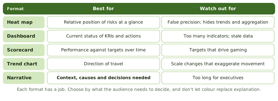
Choosing a format
The heat map
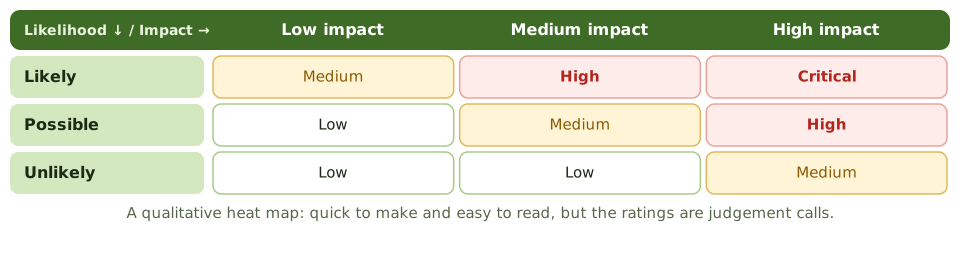
Heat maps are quick to read but subjective. They can hide trends, aggregation and uncertainty, and imply false precision.
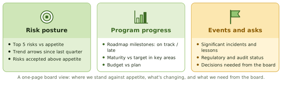
A one-page board view
Making visuals honest
- Show the appetite line or tolerance on the chart.
- Add trend arrows or previous positions.
- Keep scales the same every period.
- Add two or three sentences on what it means.
Example. A heat map showed every top risk in the same red box quarter after quarter. Adding arrows for movement showed two risks improving and one getting worse, which focused the board’s attention on the right one.
How the exam asks about it
| If the question asks… | The answer is usually… |
|---|---|
| Main benefit of a heat map | Quick view of relative risk priority |
| Main weakness of a heat map | Subjective; hides trends and aggregation |
| Best format for tracking against targets | Scorecard |
| Make a dashboard more useful | Fewer indicators, with context and trends |
In short
- Heat maps show the relative position of risks by likelihood and impact.
- Dashboards show the current status of indicators and actions; scorecards track performance against targets.
- Visuals need context: trends, appetite lines and a short narrative.
- Heat maps can hide trends, aggregation and uncertainty, and imply false precision.
- Choose the format by what the audience must decide.
Exam traps
- Letting colours replace explanation.
- Treating heat map positions as precise measurements.
- Dashboards so crowded the key signal is lost.
- Changing scales between reports so trends look different.
Slides
Click the slide and use the arrow keys. F toggles full screen.
Choosing a format
The heat map
A one-page board view
1 / 8